

The End of Irony
Anne Jaap de Rapper
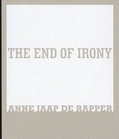
In 2003, my friends Francis Boeske and Hans Gieles of the Amsterdam gallery VOUS ETES ICI (French for “You are here”) invited me to design their series of small catalogues. Each was to be a monograph dedicated to one of their artists. As most of the booklets only had around 40 pages, I proposed to add volume by using sturdy cardboard as front and back covers, with the title silkscreened in one colour. The spines were covered with black canvas. I chose a different typeface for each cover, each somehow referring to the artist’s work; the same type family became the secondary face of the interior typography. I produced the books together with Catherine Dal (my partner in studio Dorp & Dal) who did typesetting and proofreading.
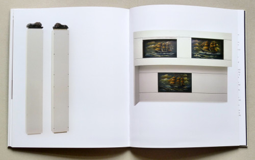
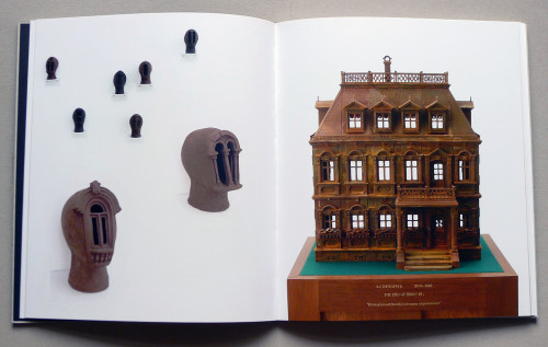
Anne Jaap de Rapper’s body of work consist of rather exuberant sculptures and installations – many of them referring to the permanent modification of architecture, of buildings designed for protection and permanence. The set of images I received for the catalogue were taken during exhibitions, and showed obtrusive portions of the spaces and the walls. In order to force the portraits of the works to speak for themselves, I spent long but relaxing hours of Photoshopping on a selection of images in order to subtly isolate their appearance. Other works were simply shown as part of an exhibition.
Headline fonts: Clarendon Condensed
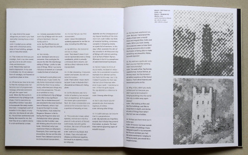
Body text face: LF Corpid by Lucas de Groot