

A False Picture
Jos van Merendonk
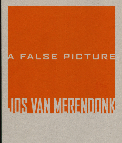
In 2003, my friends Francis Boeske and Hans Gieles of the Amsterdam gallery VOUS ETES ICI (French for “You are here”) invited me to design their series of small catalogues. Each was to be a monograph dedicated to one of their artists. As most of the booklets only had around 40 pages, I proposed to add volume by using sturdy cardboard as front and back covers, with the title silkscreened in one colour. The spines were covered with black canvas. I chose a different typeface for each cover, each somehow referring to the artist’s work; the same type family became the secondary face of the interior typography.
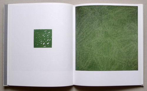
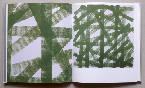
Jos van Merendonk’s work, featured in the first catalogue in the series, is characterized by dedicated, almost obsessive, consistency. All paintings are square, from small to huge, and all show abstract patterns painted in the exact same hue of green. The square field on the cover (which became an element in all subsequent designs) was derived from Jos’s work. The orange-reddish hue was, roughly, the complementary colour of the artist’s green.
Headlines: FB Agency by David Berlow
Body text face: LF Corpid by Lucas de Groot