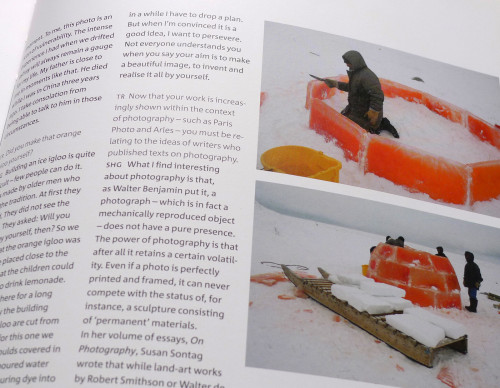
In this series’ interviews, the questions are set in Corpid Light, and the answers in Corpid Regular. I always thought that the artists’ words were more important, and wondered why the typography of interviews usually suggested the opposite.
The pictures show one of Scarlett’s North Pole projects: an igloo built with ice that contained orange colouring. The eskimo craftsmen needed a good reason for this folly, and a function for the new housing. Scarlett made one up: a club for children to drink orange juice.
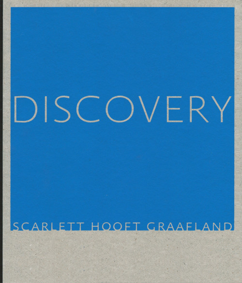
Discovery
Scarlett Hooft Graafland
In 2003, my friends Francis Boeske and Hans Gieles of the Amsterdam gallery VOUS ETES ICI (French for “You are here”) invited me to design their series of small catalogues. Each was to be a monograph dedicated to one of their artists. As most of the booklets only had around 40 pages, I proposed to add volume by using sturdy cardboard as front and back covers, with the title silkscreened in one colour. The spines were covered with black canvas. I chose a different typeface for each cover, each somehow referring to the artist’s work; the same type family became the secondary face of the interior typography. I produced the books together with Catherine Dal (my partner in studio Dorp & Dal) who did typesetting and proofreading.
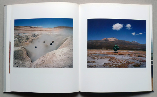
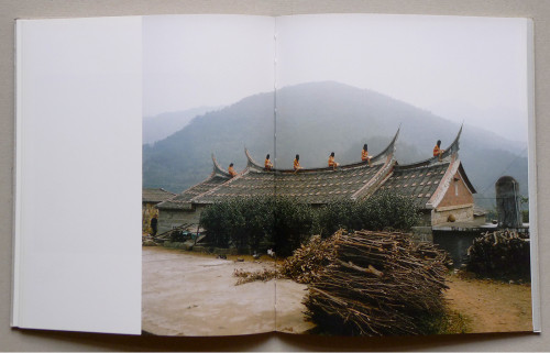
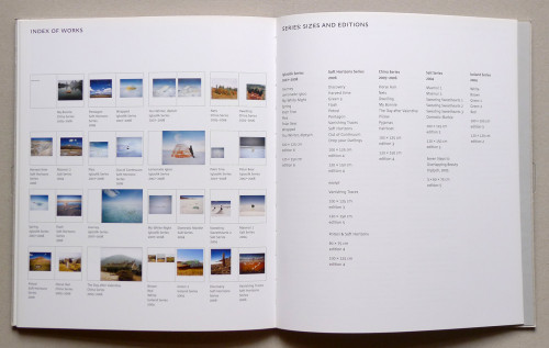
Discovery, the seventh and final catalogue in the series is probably my favourite. Scarlett Hooft Graafland is an adventurous photographer, as well as an installation and performance artist. Many of her works are created in faraway places (China, South America, the North Pole) with local participants and with no audience at all. The photos take the work to the rest of the world.
While I was working on the catalogue, Scarlett happened to have an exhibition opening in Berlin. We sat down at my desk, and discussed the layout of the photo pages. Together we established the sizes and positions of the images.
Headlines: Absara Sans by Xavier Dupré
Body text face: LF Corpid by Lucas de Groot